Wednesday, 4 March 2009

Teacher Comments

Further to our conversation in class yesterday, action points to take forward from the rough cut to final cut include:

- Add more footage. You should be shooting for a total running time of approximately two minutes.
- Continue editing so that all gaps are removed (you currently have segments of matte (black screen), which need fixing.
- Add titles (credits etc.) Remember, your final cut needs to look like an opening sequence
- Take care with continuity editing (try to achieve matches on action, avoid jump cuts, use shot reverse shot during conversations, observe the 180 degree rule etc.)
- Add your production company logo, and garageband soundtrack for it

Friday, 27 February 2009

ROUGHCUT

Wednesday, 25 February 2009

Filming schedule

scheduled by location

Lift - 
shot: 
6. long shot. 
7. long shot
9. mid shot
11. point of view
12. close-up
performers needed: Aiko
Props needed: syringe

Street - 
shot: 
26. close-up
27. close-up
28. close-up/freeze frame
Performers needed: Alice
Props: flour in a little plastic bag

Office - 
shot:
14. close-up
15. close-up
16. close-up/freeze frame
17. mid-shot
18. extreme close-up
19. close-up
20. extreme close-up
21. close-up/freeze frame
22. extreme close-up
23. extreme close-up
24: mid-shot
performers needed: Christina & Aiko
props needed: money, poker chips, telephone, playing cards, table

classroom: 
shot:
4. extreme close-up
5. close-up
8. extreme close-up
10. extreme close-up
13. close-up
25. extreme close-up
34. close-up
35. close-up
33. close-up/freeze frame
28. close-up/freeze frame
29. close-up
30. close-up
31. close-up
32. close-up
performers needed: Aiko, Esther, Alice & Cristina
props needed: skittles/pills, playing card.

Labels:

Thursday, 12 February 2009

The making of our opening music.

Before producing the opening soundtrack sequence I gathered some information to get an idea of what kind of music should be included in our soundtrack. We first worked on our storyboard so that the music and the storyboard would combine. I then put myself to think like someone who is under the influence of drugs, which I encountered to be a good way to show an essence of it through our soundtrack. For example, our storyboard starts with me (Dylan) in an elevator under influenced of taking too much different drugs at one time. From my view of someone in that situation they would most likely be tripping out badly, seeing things, hearing sounds that is not occurring at the time and in no control of themselves. The sort of sound that was in my head for this scene was something slow and eerie but at the same time a sound that is calm and relaxing that makes that person feel really happy. I started off with a sound that is deep and quite slow, then an eerie sound that is mixed in with it's volume in different levels, rising as it gets towards to the end of that scene. How I found the right mixture for that main scene was rather easy, as I chose under the electric instruments the beat called "spacey electric piano" which links to the idea of Dylan's mind in another world. After working out how long that scene was I then added a beat that was similar to the previous one, but had extra upbeat sounds in it so that it would blend in rather than completely change to create a good bridge for the two different scenes.

The next scene is more upbeat and fast therefore I added a beat that would give that adrenaline rush, and the level of volume of this soundtrack starts off low arising up as it gets to the main sound for the next scene. I found that by changing the different levels of the volume it makes a big change towards the effect that it gives, for example if the sound is faster and more upbeat it gives energy to the listener. At one point in the soundtrack, you'll notice that it gets really busy and that there is more than 2 different beats or so being played as this section represents the story board, there is lots happening within the story board therefore i linked i with the music.
The soundtrack is also categorised in different genres and or style of music to show what kind of atmosphere is in the storyboard. The disc scratch is to show that the music will change into a different style of music, like in the story board the actions too changes. In this section the music is even more eerie but at the same time really up beat and free spirit, this emphasises the actions occuring in the story board is more lively and fast move.

Usually the endings of music slowly fades out into silent, however I chose to end our music with something that is quite memorable by making the eerie sound louder as it gets to the end. Finally the last bit of the soundtrack ends with two types of music, one is called "vinyl scratch 09" which sounds really out of space and strange with an edgy effect, I then end the whole soundtrack with "deep electric piano" which is mellow and different from the whole of the soundtrack, which creates that galvanizing feeling.

Labels:

Filming in the elevator

Yesterday we filmed a scene in the elevator, since we could not all fit in the elevator at once someone had to hold the door open by pressing it open (which was hard because after a while your fingers started to hurt). Also when we were trying to show Dylan's vision to show this we tied up a scarf to the camera safely and tightly however this method did not workout as planned, because since the camera spun around to far away from the character that you could see our legs. So we went to the other alternative of manually moving the camera around to show the dizziness of the character.

Labels: , ,

Danger: Diabolik


Danger Diablik seems to be a crime caper because at the beginning all you hear is a evil laugh, and then you see men shooting at a man in a black costume. He is chucking what seems to be clothes in to a boat; which could represent him running away. Also the fast music shows he is running away aswell. The audience also don't know who the masked man is until further in the film.

Labels:

Wednesday, 11 February 2009

These are similar costumes we have used in our shots to identify and show the roll that each character plays. For example, a hooded top and black long coat identifies the person who is confused and tripping out. These clothes and accessories, show her mysterious and suspicious look:

http://www.northkites.co.uk/images/Stain%20ZipperHoodie%20Grey.jpghttp://media.dorothyperkins.com/wcsstore/DorothyPerkins//images/catalog/09002101_normal.jpg http://www.syversondesign.com/jewelry/images/necklace_black2a_lg.jpghttp://www.denims4u.co.uk/images/detail//d_3275.jpg


The poker queen could wear different costumes depending on the location. For example, she could wear a long dress if the setting was in a casino OR casual clothing if she was out at a local place where the rest of the characters meet. We have decided to go for the casual look and here are some ideas of how she could dress:

http://www.aciwholesale.com/images/JumpRingsGold.jpg http://www.virginindianhumanhair.com/pcat-gifs/products-small/Micro-Weft-Curly-Hair22.jpghttp://www.desertveils.com.au/images/hr777purple_200_x_210.jpg

THE TEAM.

Here are some ideas about what our main characters are going to be like...

Dylan - the head
Taro - the shady
Peache - the pillpopper
Cristal/Milo - the poker queen

Labels:

Wednesday, 4 February 2009

our pitch


Here is our pitch.
Feedback will follow.

Labels: , ,

Animatic

here is our animatic...

Labels: , ,

Thursday, 22 January 2009

The art of the title sequence - Justice League: The New Frontier


I think this is a crime caper film, because first of all it is about crime fighting super heroes. Also in the opening they use bright colours which fits in well with the comic book style; The heroes fighting the evil villans also represents a crime caper. The difference between Snatch and Justice league is that they are both crime capers but i would assume that Snatch is for the older audience where as Justice league is aimed at the younger audience.

Labels:

comparing snatch to love actually


Love actually and Snatch are two totally different genre of film. Love actually is a romantic comedy whereas Snatch is a crime caper. The settings are different to show the genre of the film, but the pace is quite similar, Snatch introduces all the characters one by one and there personalities show through there actions. Also most of Love actually is inside, where as Snatch is outside to show the dangers and risks in the world. Love actually has more sweet, cheerful music where as Snatch has more dramatic fast paced music.

Labels:

The art of the title sequence - Mulholland Dr.


Mulholland Dr. seems to be a crime caper, because in the opening sequence you don't see the faces of the characters in the car until towards the end of the sequence, which creates tension and suspense. Also in the beginning you see the tittle of the film brightly lit with a slight glow on a on a post somewhere and since it is very dark it stands out even more. Also at first, you see the car from the behind driving through the dark roads; Then you see the car from the inside from the lady's point of view with just the head lights as yhe main source of light. The rest of the tittles are in the same brightly lit glowing form; Then we know for sure that this film is crime caper when the two men driving suddenly stop and bring a gun out and ask the lady to come out, but are then in car crash from crazy students who were driving very fast and not paying much attention to what was around them.

Labels:

Wednesday, 21 January 2009

Analysis of the opening sequence of 'Layer Cake'.

Crime caper Layer Cake stars Daniel Craig and was released in October 2004.
Layer Cake opens with some simplistic credits on a plain background, possibly suggesting the genre of the film. No sound accompanies this until the voice-over of the main character begins. This happens when the first bit of footage is shown, a zoom of something the audience cannot yet identify. The camera then begins to zoom out, revealing the object, which turns out to be a van, shot from the back. The zoom is slow and gradual, creating suspense and indicating that something is about to happen. As maybe predicted, the doors of the van are blown open. As smoke and objects such as money float to the ground in slow-motion, following the explosion, calm, soft music begins to play. The camera then zooms out enough to reveal the rest of the set, including the first sighting of characters, and props such as guns used to demonstrate the genre. The slow-motion effect ends, and dialogue is used to realistically portray what has just happened, including threats being made and screams of panic. The calm music continues to play, creating a contrast between diegetic and non-diegetic sound. A smooth and simplistic transition is then used to introduce the next scene which shows a significant time difference from the previous scene. Here we see drugs being used in a recreational manner during the hippie-age, as the voice-over narrates, reminiscing about "the summer of love" when "hashish and LSD arrived on the scene" . A pan is then used, following another smooth transition, making the scenes flow even though the setting and time is completely different to the previous. Next a tracking shot is used to show a prison as the voice-over ridicules the inmates' reasons for being in jail, demonstrating the characters arrogance. Blatant product placement is used in the next scene as the camera tracks over rows and rows of dugs such as cocaine and ecstasy, labelled with the well known brand, 'FCUK'. This glamorizes drugs as FCUK is known as a stylish and popular brand, indicating that drugs have this same label. This is where the audience are first visually introduced to the main character, although it is not yet revealed that he is the voice-over. At the same time, the voice-over is explaining the amount of money to be made in the drug industry in a casual and proud manner, furthering the glamorized perception of drugs, the audience is receiving. Editing is then used to transform the FCUK branded illegal drugs, into legal medicinal drugs, thus revealing the main character is in a chemist. The scene then changes to the main character entering a flat where he and another character start to package cocaine. All the while, the voice-over continues to explain the conventions of drug trafficking, in particular the rules of the trade, in a condoning and casual manner. Overall, this opening sequence, identifies the genre and the content of the film quickly and smoothly. The drug content in this film is dealt with casually, treating the illegal trade as a legitimate business, even glamorizing it in some parts with the voice-over's conceited view of the industry he is so knowledgeable about.

Labels:

Tuesday, 20 January 2009

Comparing Charlies Angels with Snatch


This film opening to Charlies Angels has been edited so that at the start, each character is like a silhouette which keeps the audience in suspence to who plays which character. Where as, Snatch goes straight into showing all the characters faces and there actions that identify the part they play in the film. Both films use a voice over and music to show a main character is being introduced.

Charlies Angels has a striking sound, to justify the characters actions especially when the 3 main ones are introduced. Also, slow motion has been used and is effective because it goes with the music and suspence. Where as, Snatch has a more upbeat and fast paced sound throughout the whole opening, to create the sense a lot of things are happening at once. The diamond is the main focus of Snatch, but in Charlies Angels its more about how they work as a team throughout the film. Also, the bright fire like colour of the background and graphics used to show the title, expresses there actions as powerful. Snatch suggests some kind of team work involved in a theft, but isn't as clear on showing who is working together. I think that Charlies Angels, leaves the audience in more thought to what might happen next, where as, Snatch more or less tells you what will happen throughout the film.

Labels:

Wednesday, 14 January 2009

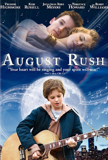
Analysis of the opening sequence of August Rush.

August Rush was released in 2007, and stars Jonathan Rhys Meyers, Keri Russell Freddie Highmore and Robin Williams. The film follows the tale of a young orphan's search for his parents, using music as his guide in a contemporary Oliver-twist style.


August Rush begins with parallel editing of two scenes, one featuring a man playing in a band and the other a woman playing the cello in an orchestra. The man is playing in a Irish soft rock band, in a gig hall with lots of fans cheering them on. The woman is in a classy orchestra, wearing an elegant dress. The mise-en-scene in each of these clips accentuates the contrast between the two characters. For example, the clothes and the setting they are in, shows a division in class and background. Camerawork is also used to reflect the contrast of characters. In the clip of the woman, the shots are long and focus mainly on the cello and the woman's face, whereas in the clip of the man, the shots are very varied, and a lot of shots taken of the band are taken from behind the audience, including more of the setting and making the atmosphere look more hip and rock n' roll like. Also in the man's clips, fast cuts are used to quicken the pace, differentiating the man and woman's lifestyle. As the film is predominantly about music, sound plays a key role in the opening sequence. When the man is on screen, the soft, Irish rock that his band is playing is on. However, when the woman is on screen, the audience can hear classical orchestra music.  As the credit's start to appear on the screen, the length of shots of the woman and the man shorten considerably, and the music changes from diegetic to non-diegetic as the allocated music for the two different clips overlap each other. This signifies the merging of the two character's worlds, and suggests that this could be a recurring theme throughout the film. Towards the end of the credits, both characters start to look uncomfortable and not content in their roles, this suggests that the characters are ready for a change from their conformed life, indicating a reason for how and why their lives may become entwined later in the film.

Labels:

production company logo research


When planning ideas for our production company logo, we looked at some existing logo's first for inspiration. Firstly, we looked at still logos. We especially liked the colourful one above, as it's attention grabbing. Also, we liked the Universal logo, as it's simple, but includes the name of the production company, as well as an image to illustrate the name. We then looked at animated logo's and thought that the Dreamworks logo was one of the best. This is because we think that the visuals concur well with the production companies name. Also, it prepares the audience for the film as it's very peaceful for the viewer, to set the scene.
We then started planning our own logo, sketching out various ideas. We chose our favourite one which was a film strip with our group members initials on it, to form our production company name. We then made it on Photoshop, and played around with colours until we were happy with the result. Next, we thought about ways we could animate it, as we decided we would prefer an animated logo, rather than a still one. Once we had decided how we was going to include motion in our logo, we thought about the music that will accompany it and tried out different sounds on garageband.

Labels: , ,

Tuesday, 13 January 2009

Analysis of the opening sequence of 'The Shining'.


The Shining opens with a still shot of a typically American winter setting of a lake surrounded by forestry and snow-topped mountains. A point-of-view shot is then used as the camera begins to move forward, curving around the river bends. The shot then changes to a birds eye view of the landscape, allowing the audience to see the extent of the isolation and vastness that the shot is trying to convey. After a couple more shots of the landscape, the camera then focus's on a car that is meandering along the desolate road. The long distance from which the car is being shot from, accentuates the solitude of the car, and indicates that isolation could play a central role in the rest of the film. Accompanying the visuals is low-pitched, eerie music. This then transforms into electronic music which has a supernatural feel to it, reflecting the genre of the film. The music demonstrates the horror that is to come later in the film, as well as unnerving the audience. The birds eye view shots of the car and the landscape continues, with the credits rolling down the screen.  Soon, the camera moves past the car to circle a large manor-like building, as the music seems to be reaching a climatic point. The focus on the building suggests that it will be the main location for the rest of the film, which turns out to be true as most of the action takes place inside and around it.

Labels:

Analysing + comparing my best friends wedding with Snatch

The opening sequence of my best friends wedding, is very different compared to Snatch. This opening sequence has a completely different setting because of the graphics and colours used to show the plot of the film. My best friends wedding identifys the protaganist to the audience through music,costume and more staged ways. Where as, Snatch identifys each character by capturing them in the act of what there doing, using descriptive words such as "Gorgeous Gage" which relates to why and what happens throughout the film. Therefore, the opening sequence does not introduce the characters in the same way as Snatch.

Snatch also has a faster pace of music that builds tension to what might or might not happen in the film, where as my best friends wedding has a calmer, expressionate and joyful pace to it.

The close up shot of the women at the end of the sequence, suggests the focus of the film is going to be about someone with similar looks and feelings as what she has just sang to her 3 friends. This part also indicates, a happy ending as she looks up and light shines down on her. On the otherhand, at the end of the opening sequence of Snatch, the close up shot of the diamond seems to be the main focus of the film, being hiden. This maintains suspence to what might happen next.

Labels:

Monday, 12 January 2009

Analysing and comparing juno with snatch.

First of all juno's opening sequence has been made by using the animation technique of rotoscoping, whereas snatch is mainly just film although for the still images they have used graphics. I think that the opening sequence of juno and the genre combine well together as what the opening sequence show and or suggest is all that you will expect to get from the actual film. Snatch is really up beat and fast which also goes well with the film itself a it is an action.
I find both interesting, mostly snatch as they use both life action and graphical pictures to give that comedy into the characters that will be in it, also it gives us an idea of what the film is going to be.

Juno's opening sequence is very simple-plain and quite dull therefore it does not interest a lot of people. Whereas in snatch it it grabs the audience attention straight away because of the technique used. Snatch uses shot reverse shot to show and create the link of the characters. How they pass on the stuff was a great idea because it makes the audience keep watching it , this idea of the shot reverse shot and still images let us recognise who are the characters.
Both opening sequence have reached their targets on the aimed audience under age range by the chosen theme song. On juno the opening sequence theme song is by Barry Louis who was described as a clown and the fact that the opening was rather dull and simple, the music and the opening itself made an ironic sequence. Furthermore the song and by looking at the song writer (Barry Louis) you can tell that it is quite childish, on the other hand Snatch which is certified for 18 in the UK is more aggressive.

Labels:

Thursday, 8 January 2009

Analysis of the opening sequence of Snatch


We chose to analyse Snatch as we are doing a crime caper with an ensemble cast, which Snatch is.


Snatch starts with a voice over by a main character, informing the audience what the film is going to be about, and giving a little description of two characters, that we know will have a central role in the film. It then cuts right to the action, showing a diamond raid at a secure site in Antwerp. This anchors the film, identifies the genre, and quickens the pace while grabbing the audience's attention. Following the heist is an introduction to all the main characters. Ritchie uses freeze frames which turns into graphics with the characters name/nickname. Some of the characters names such as "Boris the Blade" and "Doug the Head" gives the characters a gangster feel and identifies their role in the group. Ritchie's freeze frame effect has become an iconic and copied way to introduce the main characters of a film to an audience, especially when it has an ensemble cast, which requires many introductions. Between the freeze frames, the camera follows the journey of the diamond which the main characters have just stolen. This shows the fast transition of the diamond turning into money, through stages such as poker games, and smuggling. The diamond is passed from gangster to gangster. Techniques such as fast transitions, jump cuts, camera rolls and sped up footage makes the sequence more interesting and fast-paced, glamourising the diamond theft, and maintaining the audience's attention. The end of the opening sequence shows the first part of the sequence, when the theifs are sitting in the van, looking at the stolen diamond. This shows the cyclical nature of diamond theft and signals the start of the film. The title "snatch" is shown in graphics on the diamond. This shows the relativity of the title concurs to the diamond theft and tells the audience that this is what the film is going to be about.

Labels: , , ,

the crew :)

OUR GROUP;

Elyse :)
Aiko*
Cristina :)
Esther <3

Friday, 28 November 2008

T1-27 FILM OPENING PROJECT

Welcome